# 没安装flexclust包的需要先安装
data(nutrient, package = "flexclust")
row.names(nutrient) <- tolower(row.names(nutrient))

dim(nutrient) # 27行5列
## [1] 27  5

psych::headTail(nutrient)
##                 energy protein fat calcium iron
## beef braised       340      20  28       9  2.6
## hamburger          245      21  17       9  2.7
## beef roast         420      15  39       7    2
## beef steak         375      19  32       9  2.6
## ...                ...     ... ...     ...  ...
## salmon canned      120      17   5     159  0.7
## sardines canned    180      22   9     367  2.5
## tuna canned        170      25   7       7  1.2
## shrimp canned 110 23 1 98 2.68 聚类分析
聚类分析(cluster analysis)是研究如何将样品或者变量进行分类的一种方法,是在不知道有多少类别的情况下,借助数理统计方法,找出适合的分类方法,把性质相似的对象归为一类,每一个被聚到一起的类被称为簇(cluster)。
聚类分析是一种无监督方法,即没有结果变量。
物以类聚,人以群分。
本篇主要介绍如何使用R语言进行层次聚类和划分聚类(包括K均值聚类和PAM)。
8.1 系统聚类
系统聚类又被称为层次聚类,英文:Hierarchical clustering
使用nutrient数据集进行演示。
该数据集包括27种食物的不同营养成分含量,我们需要借助聚类分析把这27种食物归为不同的类别。
层次聚类在R语言中非常简单,通过hclust实现。
不管是哪种类型的聚类分析,都需要找到一个评价相似性的指标,通常使用相似系数(similarity coefficient)衡量,相似系数类似于相关系数,但是并不是完全一样。
由于计算相似系数需要计算不同样本间的距离,因此就需要对数据提前进行标准化处理,以消除不同单位对计算的影响。一般来说,样本间的距离越大,样本间的相异质性越大,相似性越小。
计算距离时,有以下几种方法(其实还有非常多,可参考距离定义):
- 欧氏距离(Euclidean)
- 绝对距离(曼哈顿距离,Manhattan)
- 马氏距离(Mahalanobis):欧式距离的平方
- 闵可夫斯基距离(Minkowski)
- 兰氏距离(Lance and Williams),又称为堪培拉距离(Canberra)
- 杰卡德距离(Jaccard),又称为二元距离,用来计算二元变量的距离
计算相似系数也有多种不同的方法,比如:
- single:单联动法,一个簇中的点到另一个簇中的点的最小距离
- complete:全联动法,一个簇中的点到另一个簇中的点的最大距离
- average:平均联动法,一个簇中的点到另一个簇中的点的平均距离
- ward.D:Ward法,两个簇之间所有变量的方差分析的平方和
- centroid:质心法,两个簇的质心之间的距离
提示
单联动聚类方法倾向于发现细长的、雪茄型的聚类簇。它也通常展示一种链式的现象,即不相似的观测值分到一个聚类簇中,因为它们和它们的中间值很相像。 全联动聚类倾向于发现具有大致相等直径的紧凑型聚类簇。它对异常值很敏感。 平均联动提供了以上两种方法的折中。相对来说,它不像链式,而且对异常值没有那么敏感。它倾向于把方差小的聚类簇聚合。 Ward 法倾向于把有少量观测值的聚类簇聚合到一起,并且倾向于产生与观测值数目大致相等的聚类簇。它对异常值也是敏感的。 质心法是一种很受欢迎的方法,因为其中聚类簇距离的定义比较简单、易于理解。相比其他方法,它对异常值不是很敏感。但是,它可能不如平均联动或Ward法表现得好。 –《R语言实战》
由于聚类分析需要计算距离,所以要把所有变量的单位放在同一尺度上,不能有的是几万,有的是零点几。
# 聚类前先进行标准化
nutrient.scaled <- scale(nutrient)

# 然后计算距离,方法就选择欧氏距离。这也是默认方法
d <- dist(nutrient.scaled,method = "euclidean")

# 进行层次聚类
h.clust <- hclust(d,
                  method = "average" # 计算相似系数的方法
                  )
这样我们就完成了聚类分析。
plot(h.clust,main = "",xlab = "")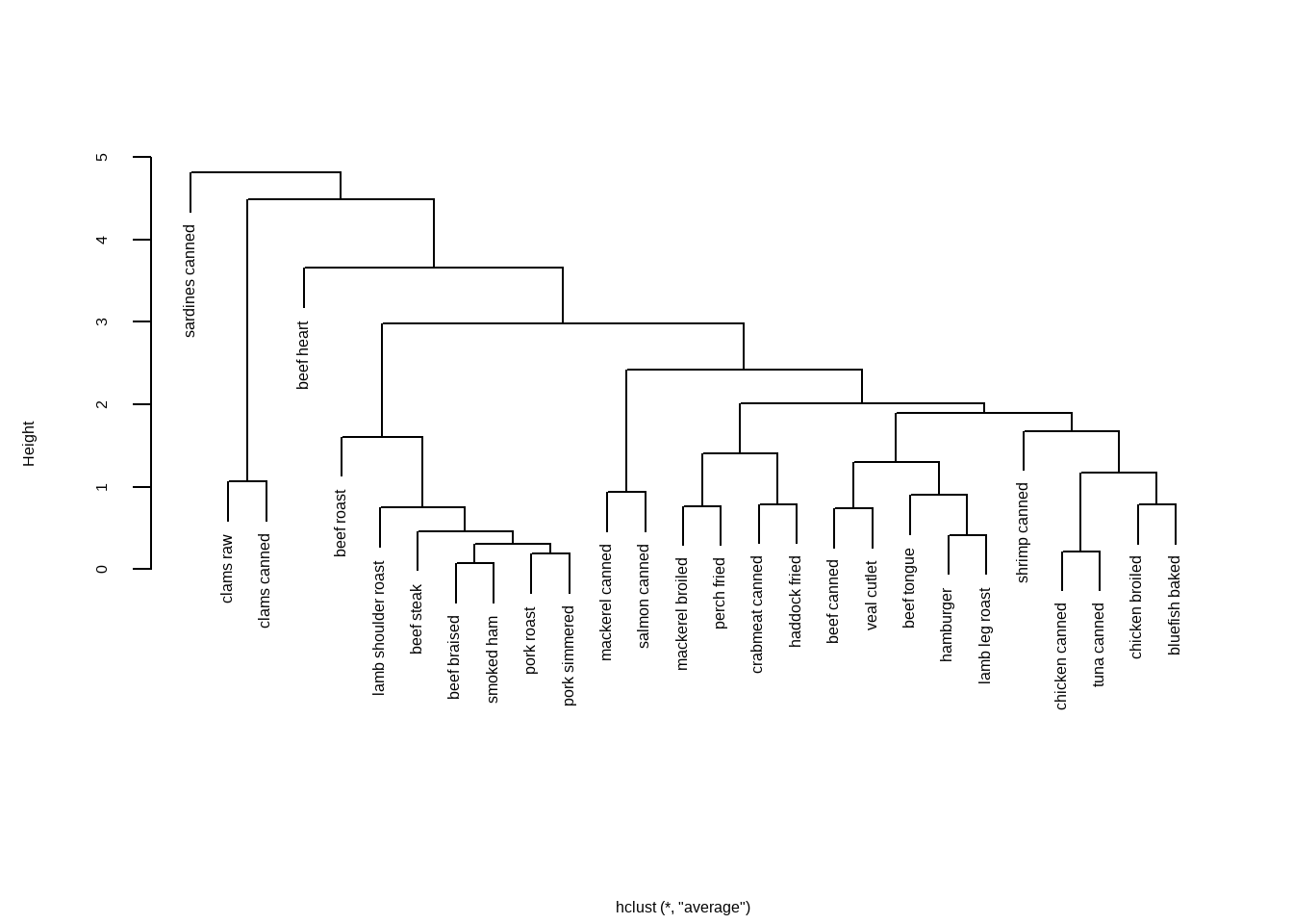
树状图应该从下往上读,它展示了这些食物如何被聚到一起。
每个观测值起初自成一个聚类簇,然后相距最近的两个聚类簇(beef braised和smoked ham)合并。比如,pork roast和pork simmered合并,chicken canned和 tuna canned合并。
然后,beef braised/smoked ham这一簇和pork roast/pork simmered这一簇合并(这个聚类簇目前包含4种食品)。合并继续进行下去,直到所有的食物合并成一个聚类簇。
纵坐标的刻度代表了该高度的聚类簇之间合并的判定值。
如果我们的目的是理解不同食物营养物质之间的相似性和异质性,那么做到这里就可以满足需求了。但是如果我们想要知道到底聚成几个类才是最合适的,就需要继续探索。
聚类是把性质相似的样本聚在一起,通常我们也不知道应该分为几类比较合适,那么到底如何选择最佳的聚类个数呢?
可以通过R包NbClust实现。
library(NbClust)
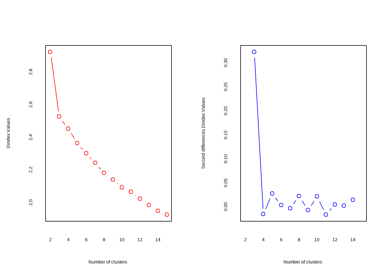
nc <- NbClust(nutrient.scaled, distance = "euclidean",
min.nc = 2, # 最小聚类数
max.nc = 10, # 最大聚类数
method = "average"
)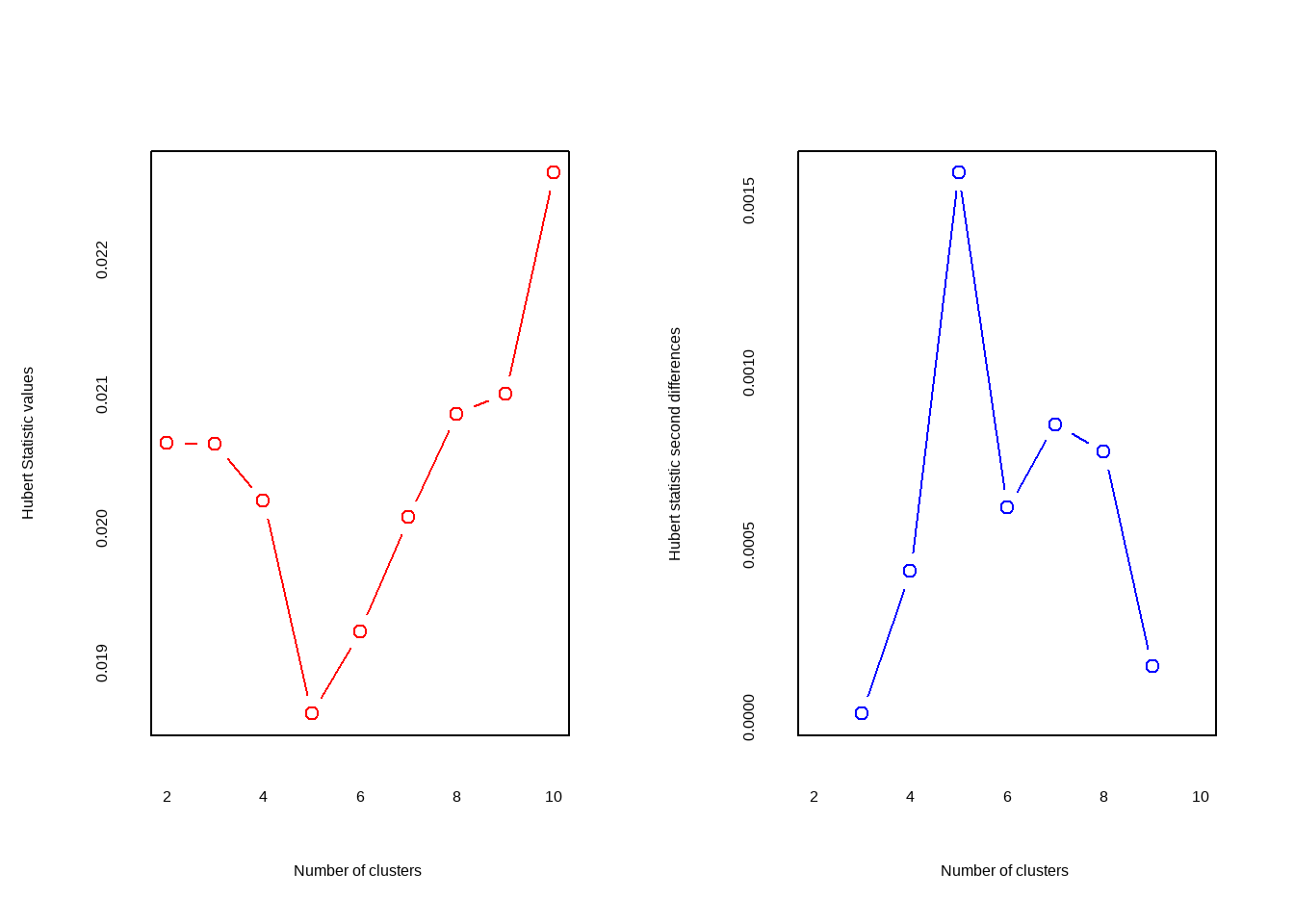
## *** : The Hubert index is a graphical method of determining the number of clusters.
##                 In the plot of Hubert index, we seek a significant knee that corresponds to a
##                 significant increase of the value of the measure i.e the significant peak in Hubert
##                 index second differences plot.
## 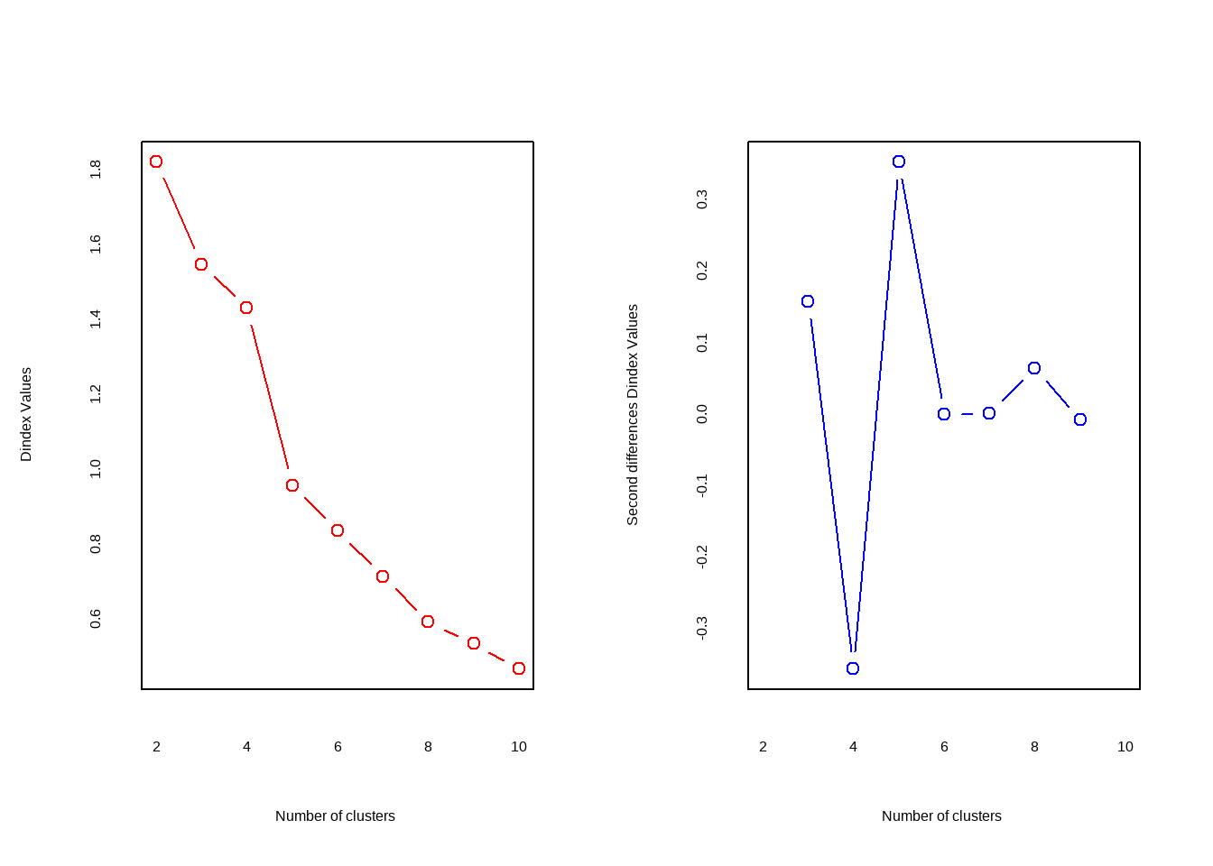
## *** : The D index is a graphical method of determining the number of clusters.
##                 In the plot of D index, we seek a significant knee (the significant peak in Dindex
##                 second differences plot) that corresponds to a significant increase of the value of
##                 the measure.
##
## *******************************************************************
## * Among all indices:
## * 5 proposed 2 as the best number of clusters
## * 5 proposed 3 as the best number of clusters
## * 2 proposed 4 as the best number of clusters
## * 4 proposed 5 as the best number of clusters
## * 1 proposed 8 as the best number of clusters
## * 1 proposed 9 as the best number of clusters
## * 5 proposed 10 as the best number of clusters
##
##                    ***** Conclusion *****
##
## * According to the majority rule, the best number of clusters is  2
##
##
## *******************************************************************
输出日志里给出了评判准则以及最终结果。
Hubert index和D index使用图形的方式判断最佳聚类个数,拐点明显的可视作最佳聚类个数。
它给出的结论是最佳聚类数是2。我们也可以通过条形图查看这些评判准则的具体数量。
barplot(table(nc$Best.nc[1,]),
        xlab = "聚类数目",
        ylab = "评判准则个数"
        )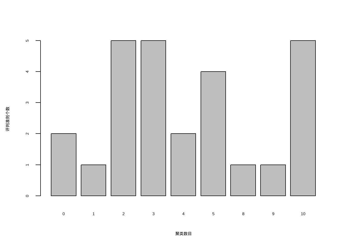
从条形图中可以看出,聚类数目为2,3,5,10时,评判准则个数最多,为5个,这里我们可以选择5个(也可以选择2,3,10,根据需要选择即可)。
# 把聚类树划分为5类
cluster <- cutree(h.clust, k=5)

# 查看每一类有多少例
table(cluster)
## cluster
##  1  2  3  4  5
##  7 16  1  2  1
把最终结果画出来:
plot(h.clust, hang = -1,main = "",xlab = "")
rect.hclust(h.clust, k=5) # 添加矩形,方便观察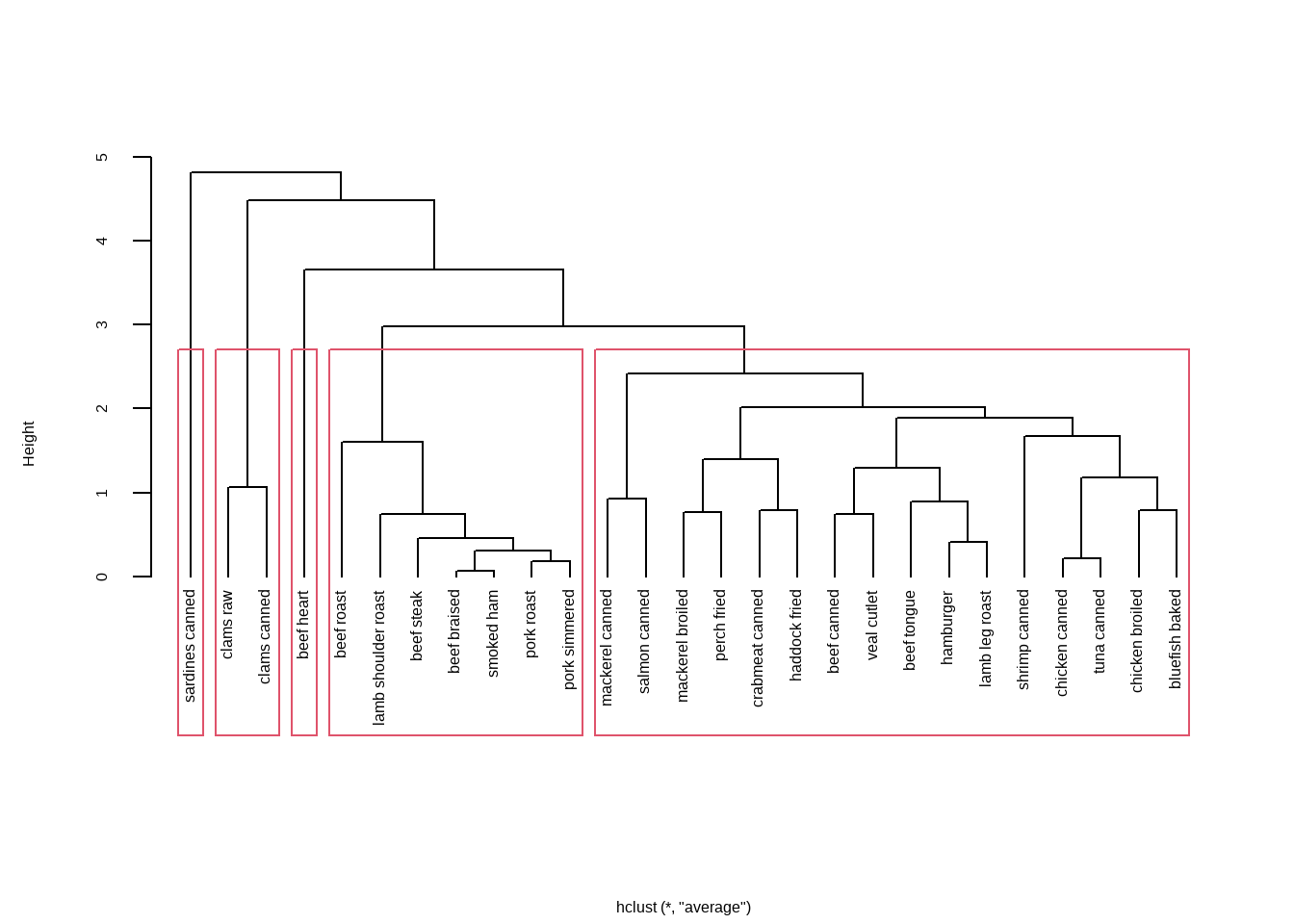
8.2 系统聚类可视化
对于聚类分析,可视化结果是非常重要的一步。
简单点可以直接用plot()函数进行聚类树的可视化。
plot(h.clust,hang = -1,main = "层次聚类", sub="",
     xlab="", cex.lab = 1.0, cex.axis = 1.0, cex.main = 2)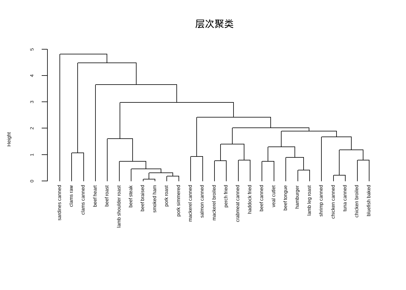
默认的聚类树可视化函数已经非常好用,有非常多的自定义设置,可以轻松实现好看的聚类树可视化。
# 修改画布背景色
op <- par(bg = "grey90")

# 细节修改
plot(h.clust,
     main = "层次聚类", # 主标题
     sub="",            # 次标题
     xlab = "",         # x轴标题
     col = "#487AA1",   # 主体颜色
     col.main = "#45ADA8", # 主标题颜色
     col.lab = "#7C8071",  # 坐标轴标签颜色
     col.axis = "#F38630", # 坐标轴颜色
     lwd = 2,           # 线条宽度
     lty = 1,           # 线条类型
     hang = -1,         # 对齐
     axes = FALSE)      # 不画坐标轴
# 自己增加坐标轴
axis(side = 2, at = 0:5, col = "#F38630",
     labels = FALSE, lwd = 2)
# 增加坐标轴文字
mtext(0:5, side = 2, at = 0:5,
      line = 1, col = "#A38630", las = 2)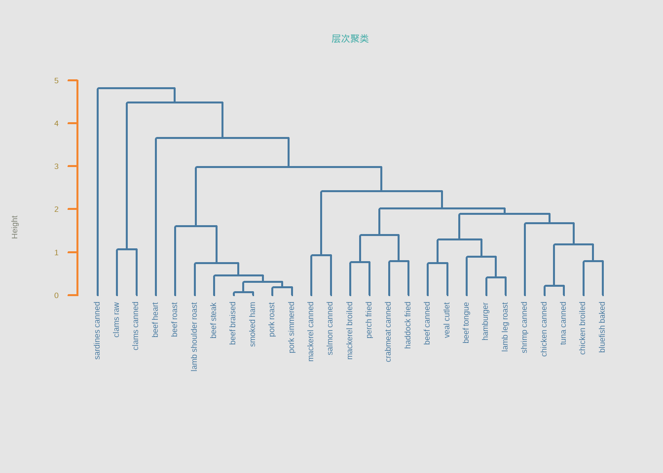
# 修改结束
par(op)如果对默认的可视化效果不满意,可以先用as.dendrogram()转化一下,再画图可以指定更多细节。
dhc <- as.dendrogram(h.clust)
plot(dhc,type = "triangle") # 比如换个类型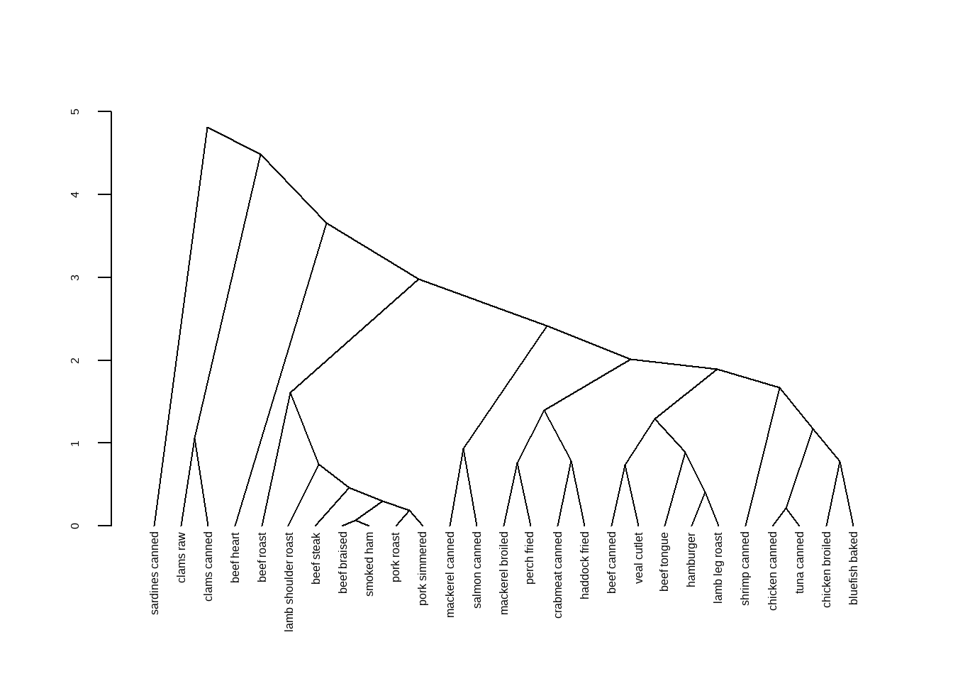
可以提取部分树进行查看,使用cut指定某个高度以上或以下的树进行查看。
op <- par(mfrow = c(2, 1))

# 高度在3以上的树
plot(cut(dhc, h = 3)$upper, main = "Upper tree of cut at h=3")

# 高度在3以下的树
plot(cut(dhc, h = 3)$lower[[2]],
     main = "Second branch of lower tree with cut at h=3")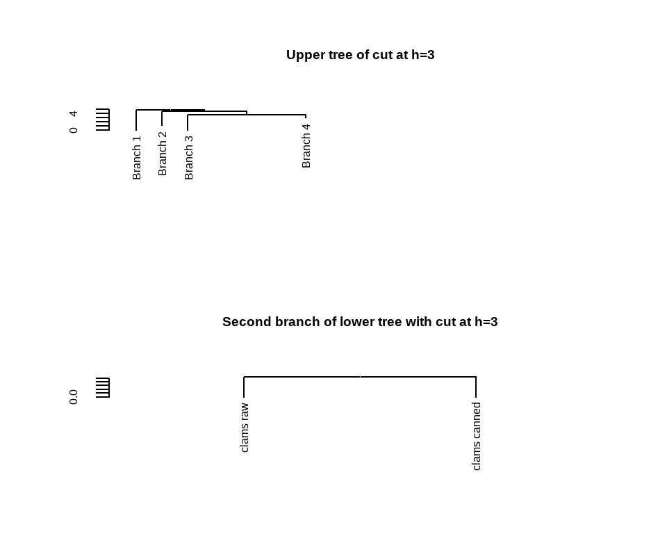
par(op)每一个节点都有不同的属性,比如颜色、形状等,我们可以用函数修改每个节点的属性。
比如修改标签的颜色。
# 按照上面画出来的结果,我们可以分为5类,所以准备好5个颜色
labelColors = c("#CDB380", "#036564", "#EB6841", "#EDC951", "#487AA1")

# 把聚类树分为5个类
clusMember <- cutree(h.clust,k=5)

# 给标签增加不同的颜色
colLab <- function(n) {
  if (is.leaf(n)) {
    a <- attributes(n)
    labCol <- labelColors[clusMember[which(names(clusMember) == a$label)]]
    attr(n, "nodePar") <- c(a$nodePar,
                            list(cex=1.5, # 节点形状大小
                                 pch=20, # 节点形状
                                 col=labCol, # 节点颜色
                                 lab.col=labCol, # 标签颜色
                                 lab.font=2, # 标签字体,粗体斜体粗斜体
                                 lab.cex=1 # 标签大小
                                 )
                            )
  }
  n
}

# 把自定义标签颜色应用到聚类树中
diyDendro = dendrapply(dhc, colLab)

# 画图
plot(diyDendro, main = "DIY Dendrogram")

# 加图例
legend("topright",
     legend = c("Cluster 1","Cluster 2","Cluster 3","Cluster 4","Cluster 5"),
     col = c("#CDB380", "#036564", "#EB6841", "#EDC951", "#487AA1"),
     pch = c(20,20,20,20,20), bty = "n", pt.cex = 2, cex = 1 ,
     text.col = "black", horiz = FALSE, inset = c(0, 0.1))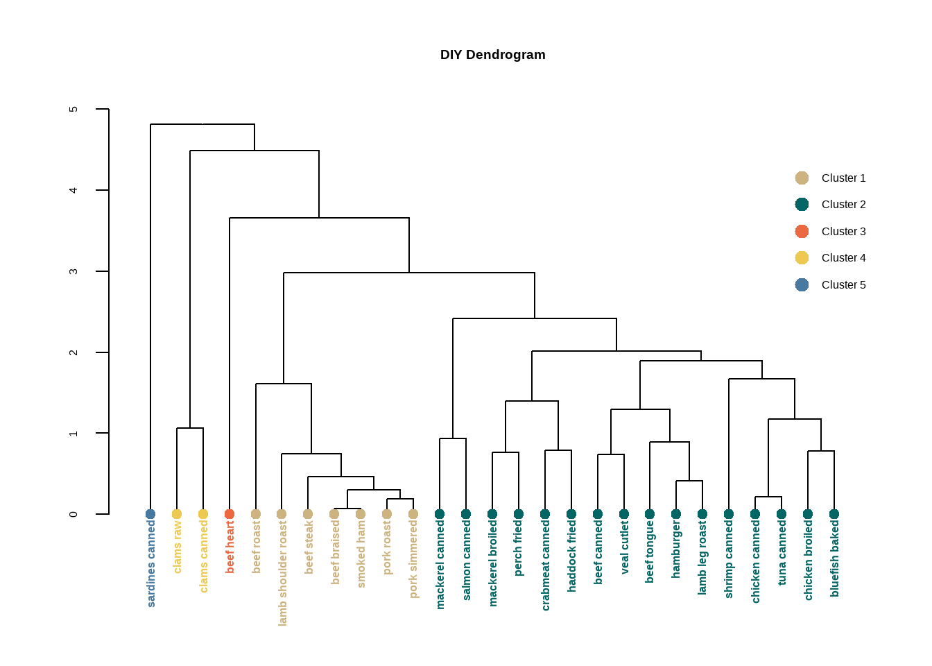
也可以使用colorhcplot包:
# 把聚类树分为5个类
clusMember <- cutree(h.clust,k=5)

cl <- factor(clusMember, levels = c(1:5),labels = paste("cluster",1:5))

library(colorhcplot)
## Warning: package 'colorhcplot' was built under R version 4.3.3
colorhcplot(h.clust, cl, hang = -1)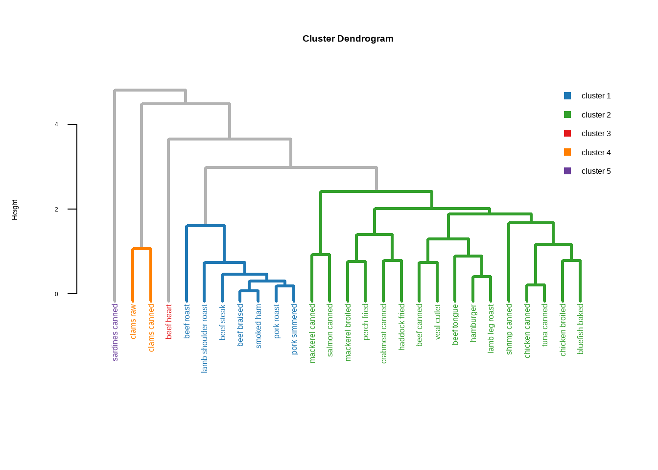
如果想要更加精美的聚类分析可视化,可以参考之前的几篇推文:
8.3 快速聚类
又被称为划分聚类,partitioning clustering
8.3.1 K-means聚类
K-means聚类,K均值聚类,是快速聚类的一种。比层次聚类更适合大样本的数据。在R语言中可以通过kmeans()实现K均值聚类。
使用K均值聚类处理178种葡萄酒中13种化学成分的数据集,目标是根据化学成分的相似性对这178种葡萄酒进行分类。
data(wine, package = "rattle")
# 标准化数据
df <- scale(wine[,-1])

psych::headTail(df)
##     Alcohol Malic   Ash Alcalinity Magnesium Phenols Flavanoids Nonflavanoids
## 1      1.51 -0.56  0.23      -1.17      1.91    0.81       1.03         -0.66
## 2      0.25  -0.5 -0.83      -2.48      0.02    0.57       0.73         -0.82
## 3       0.2  0.02  1.11      -0.27      0.09    0.81       1.21          -0.5
## 4      1.69 -0.35  0.49      -0.81      0.93    2.48       1.46         -0.98
## ...     ...   ...   ...        ...       ...     ...        ...           ...
## 175    0.49  1.41  0.41       1.05      0.16   -0.79      -1.28          0.55
## 176    0.33  1.74 -0.39       0.15      1.42   -1.13      -1.34          0.55
## 177    0.21  0.23  0.01       0.15      1.42   -1.03      -1.35          1.35
## 178    1.39  1.58  1.36        1.5     -0.26   -0.39      -1.27          1.59
##     Proanthocyanins Color   Hue Dilution Proline
## 1              1.22  0.25  0.36     1.84    1.01
## 2             -0.54 -0.29   0.4     1.11    0.96
## 3              2.13  0.27  0.32     0.79    1.39
## 4              1.03  1.18 -0.43     1.18    2.33
## ...             ...   ...   ...      ...     ...
## 175           -0.32  0.97 -1.13    -1.48    0.01
## 176           -0.42  2.22 -1.61    -1.48    0.28
## 177           -0.23  1.83 -1.56     -1.4     0.3
## 178 -0.42 1.79 -1.52 -1.42 -0.59进行K均值聚类时,需要在一开始就指定聚类的个数,我们也可以通过NbClust包实现这个过程。
library(NbClust)

set.seed(123)
nc <- NbClust(df, min.nc = 2, max.nc = 15, method = "kmeans")# 方法选择kmeans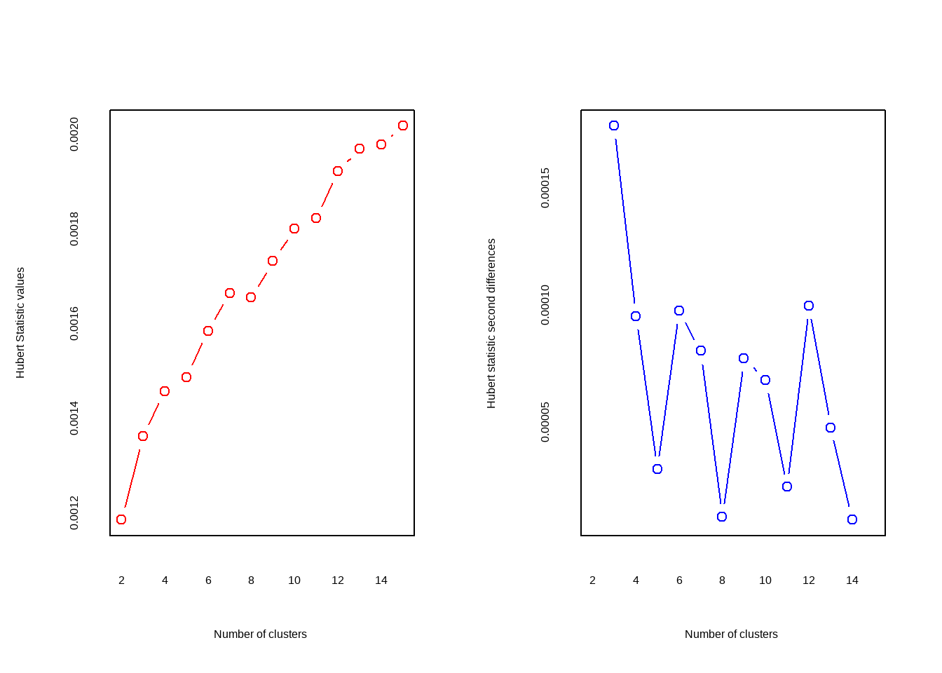
## *** : The Hubert index is a graphical method of determining the number of clusters.
##                 In the plot of Hubert index, we seek a significant knee that corresponds to a
##                 significant increase of the value of the measure i.e the significant peak in Hubert
##                 index second differences plot.
## 
## *** : The D index is a graphical method of determining the number of clusters.
##                 In the plot of D index, we seek a significant knee (the significant peak in Dindex
##                 second differences plot) that corresponds to a significant increase of the value of
##                 the measure.
##
## *******************************************************************
## * Among all indices:
## * 2 proposed 2 as the best number of clusters
## * 19 proposed 3 as the best number of clusters
## * 1 proposed 14 as the best number of clusters
## * 1 proposed 15 as the best number of clusters
##
##                    ***** Conclusion *****
##
## * According to the majority rule, the best number of clusters is  3
##
##
## *******************************************************************
结果中给出了划分依据以及最佳的聚类数目为3个,可以画图查看结果:
table(nc$Best.nc[1,])
##
##  0  1  2  3 14 15
##  2  1  2 19  1  1

barplot(table(nc$Best.nc[1,]),
        xlab = "聚类数目",
        ylab = "评判准则个数"
        )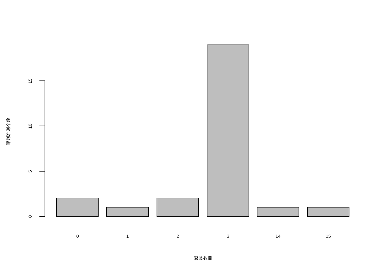
可以看到聚类数目为3是最佳的选择。
确定最佳聚类个数过程也可以通过非常好用的R包factoextra实现。
library(factoextra)
## Loading required package: ggplot2
## Welcome! Want to learn more? See two factoextra-related books at https://goo.gl/ve3WBa

set.seed(123)
fviz_nbclust(df, kmeans, k.max = 15)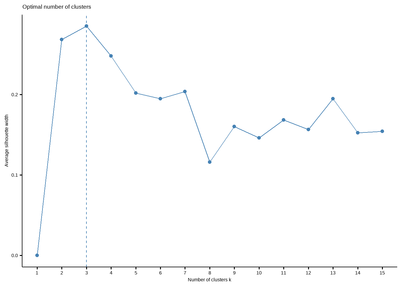
这个结果给出的最佳聚类个数也是3个。
下面进行K均值聚类,聚类数目设为3。
K均值聚类在每次开始前需要随机选择K个质心。
# 设置种子数保证结果可复现
set.seed(123)
fit.km <- kmeans(df, centers = 3, nstart = 25) # 尝试多种配置选择最好的一个
fit.km
## K-means clustering with 3 clusters of sizes 51, 62, 65
##
## Cluster means:
##      Alcohol      Malic        Ash Alcalinity   Magnesium     Phenols
## 1  0.1644436  0.8690954  0.1863726  0.5228924 -0.07526047 -0.97657548
## 2  0.8328826 -0.3029551  0.3636801 -0.6084749  0.57596208  0.88274724
## 3 -0.9234669 -0.3929331 -0.4931257  0.1701220 -0.49032869 -0.07576891
##    Flavanoids Nonflavanoids Proanthocyanins      Color        Hue   Dilution
## 1 -1.21182921    0.72402116     -0.77751312  0.9388902 -1.1615122 -1.2887761
## 2  0.97506900   -0.56050853      0.57865427  0.1705823  0.4726504  0.7770551
## 3  0.02075402   -0.03343924      0.05810161 -0.8993770  0.4605046  0.2700025
##      Proline
## 1 -0.4059428
## 2  1.1220202
## 3 -0.7517257
##
## Clustering vector:
##   [1] 2 2 2 2 2 2 2 2 2 2 2 2 2 2 2 2 2 2 2 2 2 2 2 2 2 2 2 2 2 2 2 2 2 2 2 2 2
##  [38] 2 2 2 2 2 2 2 2 2 2 2 2 2 2 2 2 2 2 2 2 2 2 3 3 1 3 3 3 3 3 3 3 3 3 3 3 2
##  [75] 3 3 3 3 3 3 3 3 3 1 3 3 3 3 3 3 3 3 3 3 3 2 3 3 3 3 3 3 3 3 3 3 3 3 3 3 3
## [112] 3 3 3 3 3 3 3 1 3 3 2 3 3 3 3 3 3 3 3 1 1 1 1 1 1 1 1 1 1 1 1 1 1 1 1 1 1
## [149] 1 1 1 1 1 1 1 1 1 1 1 1 1 1 1 1 1 1 1 1 1 1 1 1 1 1 1 1 1 1
##
## Within cluster sum of squares by cluster:
## [1] 326.3537 385.6983 558.6971
##  (between_SS / total_SS =  44.8 %)
##
## Available components:
##
## [1] "cluster"      "centers"      "totss"        "withinss"     "tot.withinss"
## [6] "betweenss"    "size"         "iter"         "ifault"
结果很详细,K均值聚类聚为3类,每一类数量分别是51,62,65。然后还给出了聚类中心(Cluster means),每一个观测分别属于哪一个类(Clustering vector)。
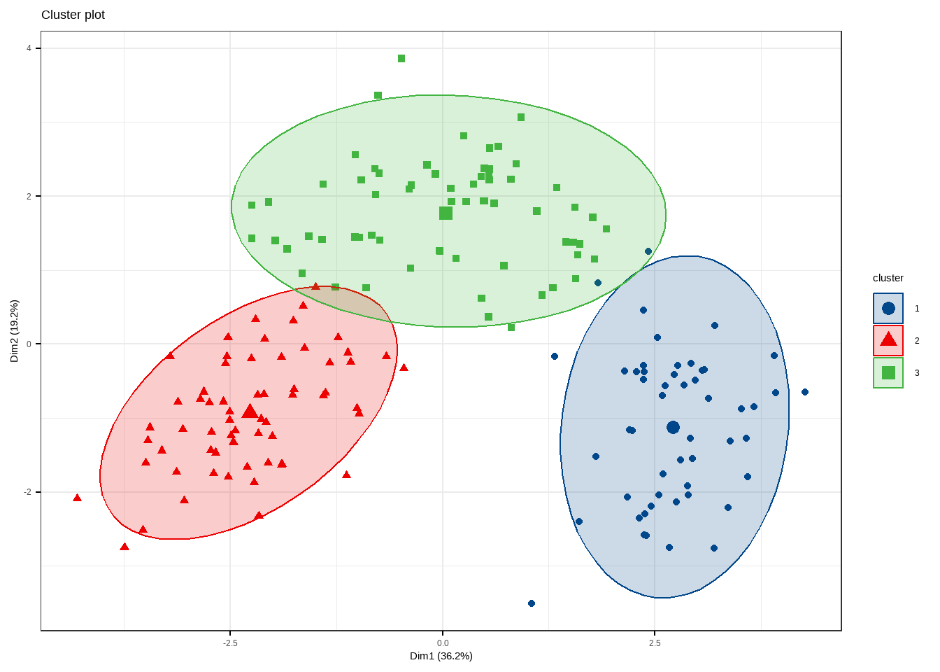
不管是哪一种聚类方法,factoextra配合factomineR都可以给出非常好看的可视化结果。
fviz_cluster(fit.km, data = df)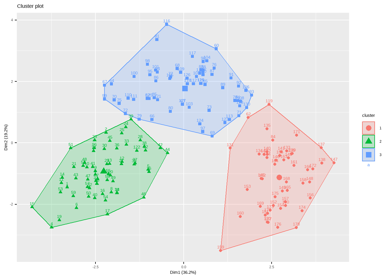
有非常多的细节可以调整,大家在使用的时候可以自己尝试,和之前推文中介绍的PCA美化一样,也是支持ggplot2语法的。
fviz_cluster(fit.km, data = df,
             ellipse = T, # 增加椭圆
             ellipse.type = "t", # 椭圆类型
             geom = "point", # 只显示点不要文字
             palette = "lancet", # 支持超多配色方案
             ggtheme = theme_bw() # 支持更换主题
             )
聚类分析是不需要使用结果变量的,但是我们用的这个葡萄酒数据其实提供了真实的分类结果,此时我们可以评价下这个方法和真实结果的一致性如何,通关计算兰德指数(Rand Index)实现:
library(flexclust)
## Loading required package: grid
## Loading required package: lattice
## Loading required package: modeltools
## Loading required package: stats4

tb <- table(wine$Type, fit.km$cluster)
randIndex(tb)
##      ARI
## 0.897495
兰德指数的范围是[-1,1],-1表示完全不一致,1表示完全一致,所以我们这个结果还是非常好的。
8.3.2 围绕中心点的划分PAM
K均值聚类是基于均值的,所以对异常值很敏感。一个更稳健的方法是围绕中心点的划分(PAM)。用一个最有代表性的观测值代表这一类(有点类似于主成分)。K均值聚类一般使用欧氏距离,而PAM可以使用任意的距离来计算。因此,PAM可以容纳混合数据类型,并且不仅限于连续变量。
我们还是用葡萄酒数据进行演示。PAM聚类可以通过cluster包中的pam()实现。
library(cluster)

set.seed(123)
fit.pam <- pam(wine[,-1], k=3 # 聚为3类
               , stand = T # 聚类前进行标准化
               )
fit.pam
## Medoids:
##       ID Alcohol Malic  Ash Alcalinity Magnesium Phenols Flavanoids
## [1,]  36   13.48  1.81 2.41       20.5       100    2.70       2.98
## [2,] 107   12.25  1.73 2.12       19.0        80    1.65       2.03
## [3,] 175   13.40  3.91 2.48       23.0       102    1.80       0.75
##      Nonflavanoids Proanthocyanins Color  Hue Dilution Proline
## [1,]          0.26            1.86   5.1 1.04     3.47     920
## [2,]          0.37            1.63   3.4 1.00     3.17     510
## [3,]          0.43            1.41   7.3 0.70     1.56     750
## Clustering vector:
##   [1] 1 1 1 1 1 1 1 1 1 1 1 1 1 1 1 1 1 1 1 1 1 1 1 1 1 1 1 1 1 1 1 1 1 1 1 1 1
##  [38] 1 1 1 1 1 1 1 1 1 1 1 1 1 1 1 1 1 1 1 1 1 1 2 2 2 2 1 2 1 2 2 2 1 2 1 2 1
##  [75] 1 2 2 2 1 1 2 2 2 3 2 2 2 2 2 2 2 2 2 2 2 1 1 2 1 2 2 2 2 2 2 2 2 2 2 1 1
## [112] 2 2 2 2 2 2 2 2 2 1 1 3 2 1 2 2 2 2 2 3 3 3 3 2 3 3 3 3 3 3 3 3 3 3 3 3 3
## [149] 3 3 3 3 3 3 3 3 3 3 3 3 3 3 3 3 3 3 3 3 3 3 3 3 3 3 3 3 3 3
## Objective function:
##    build     swap
## 3.593378 3.476783
##
## Available components:
##  [1] "medoids"    "id.med"     "clustering" "objective"  "isolation"
## [6] "clusinfo" "silinfo" "diss" "call" "data"Medoids给出了中心点,用第36个观测代表第1类,第107个观测代表第2类,第175个观测代表第3类。Clustering vector给出了每一个观测分别属于哪一个类。结果可以画出来:
clusplot(fit.pam, main = "PAM cluster")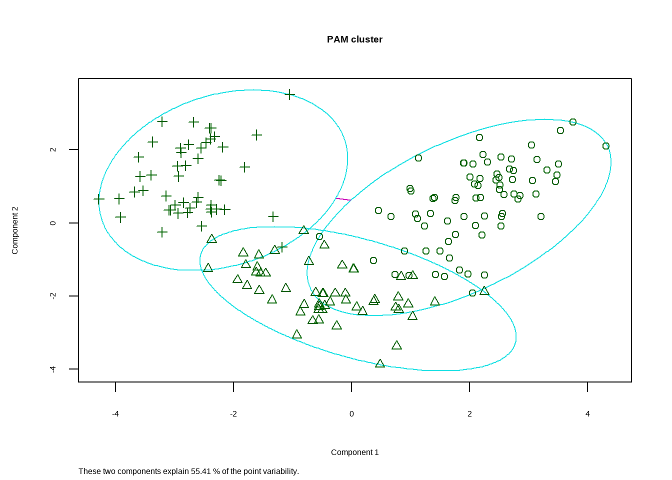
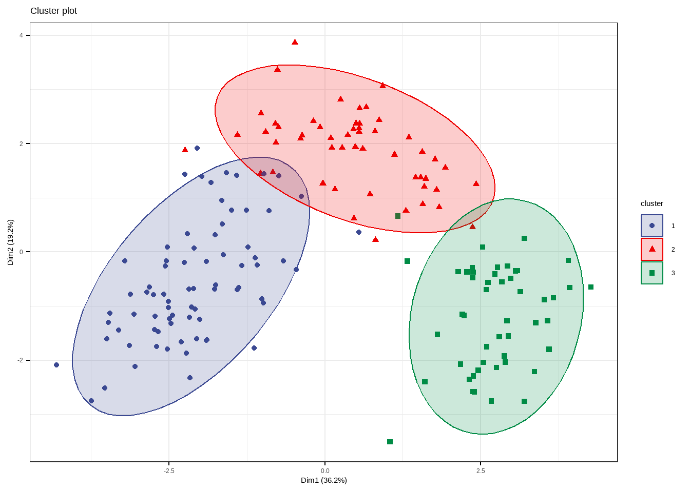
同样也可以用factoextra包实现可视化。
fviz_cluster(fit.pam,
             ellipse = T, # 增加椭圆
             ellipse.type = "t", # 椭圆类型
             geom = "point", # 只显示点不要文字
             palette = "aaas", # 支持超多配色方案
             ggtheme = theme_bw() # 支持更换主题
             )
也是用兰德指数看下一致性:
tb <- table(wine$Type, fit.pam$clustering)
randIndex(tb)
##       ARI
## 0.6994957
效果不如K均值聚类好。
8.4 参考资料
- R帮助文档
- https://r-graph-gallery.com/31-custom-colors-in-dendrogram.html
- https://www.gastonsanchez.com/visually-enforced/how-to/2012/10/0/Dendrograms/
- 孙振球版医学统计学第四版
- R语言实战第三版