data10_4 <- data.frame(`灌注方法`=c("方法1","方法2","方法3"),
                       rate = c(17.9,20.8,33.3))
data10_4
##   灌注方法 rate
## 1    方法1 17.9
## 2    方法2 20.8
## 3 方法3 33.38 统计绘图
统计绘图是介绍各种常用的统计图形,比如:条形图、箱线图、直方图、饼图、茎叶图、地图等。本章内容例题数据来自于孙振球《医学统计学》第4版第10章。
统计绘图是R语言的拿手好戏,下面将会给大家介绍常见的统计图表的绘制。以下图形的各种细节都可以根据自己的需要进行个性化的修改。
R语言绘图我只推荐三本书:
- 《ggplot2数据分析与图形艺术》
- 《R数据可视化手册》
- 《R绘图系统》
8.1 条形图
例10-4。条形图。
library(ggplot2)
## Warning: package 'ggplot2' was built under R version 4.5.3
library(ggprism)

ggplot(data10_4, aes(`灌注方法`,rate))+
  geom_bar(stat = "identity",fill="white",color="black",width = 0.4)+
  ylab("再发率(%)")+
  scale_y_continuous(expand = c(0,0))+
  theme_classic()+
  theme(axis.title = element_text(color = "black",size = 15))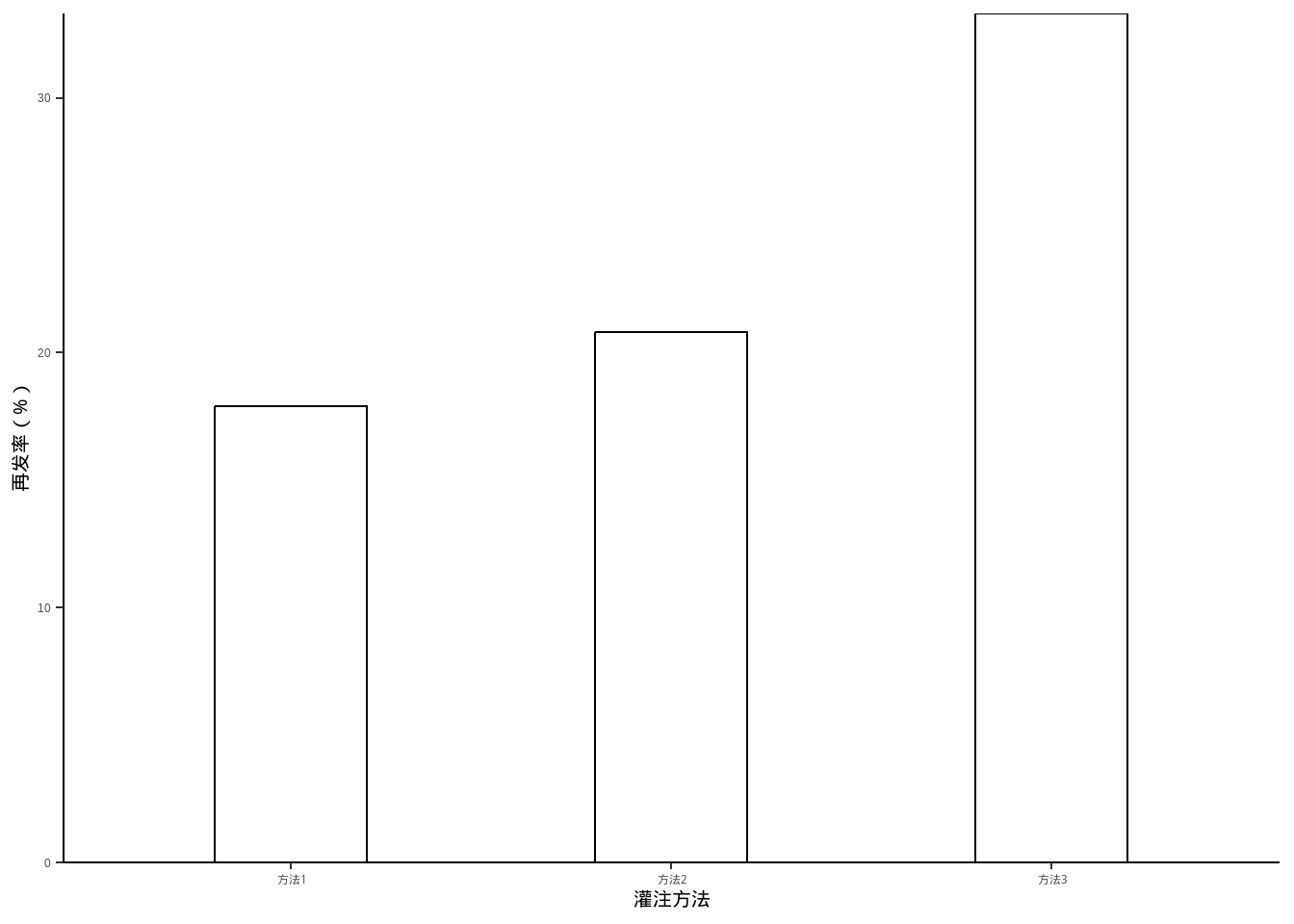
8.2 分组条形图
例10-5。分组条形图。
library(haven)
data10_5 <- haven::read_sav("datasets/例10-05.sav")
data10_5 <- as_factor(data10_5)
data10_5
## # A tibble: 4 × 3
##   year  agent  rate
##   <fct> <fct> <dbl>
## 1 2005  男       75
## 2 2005  女       60
## 3 2010  男       56
## 4 2010 女 53library(ggplot2)
ggplot(data10_5, aes(agent,rate))+
geom_bar(stat = "identity",aes(fill=year),position = "dodge")+
labs(x="性别",y="患龋率(%)",fill="年份")+
scale_y_continuous(expand = c(0,0))+
theme_classic()+
theme(axis.title = element_text(color = "black",size = 15))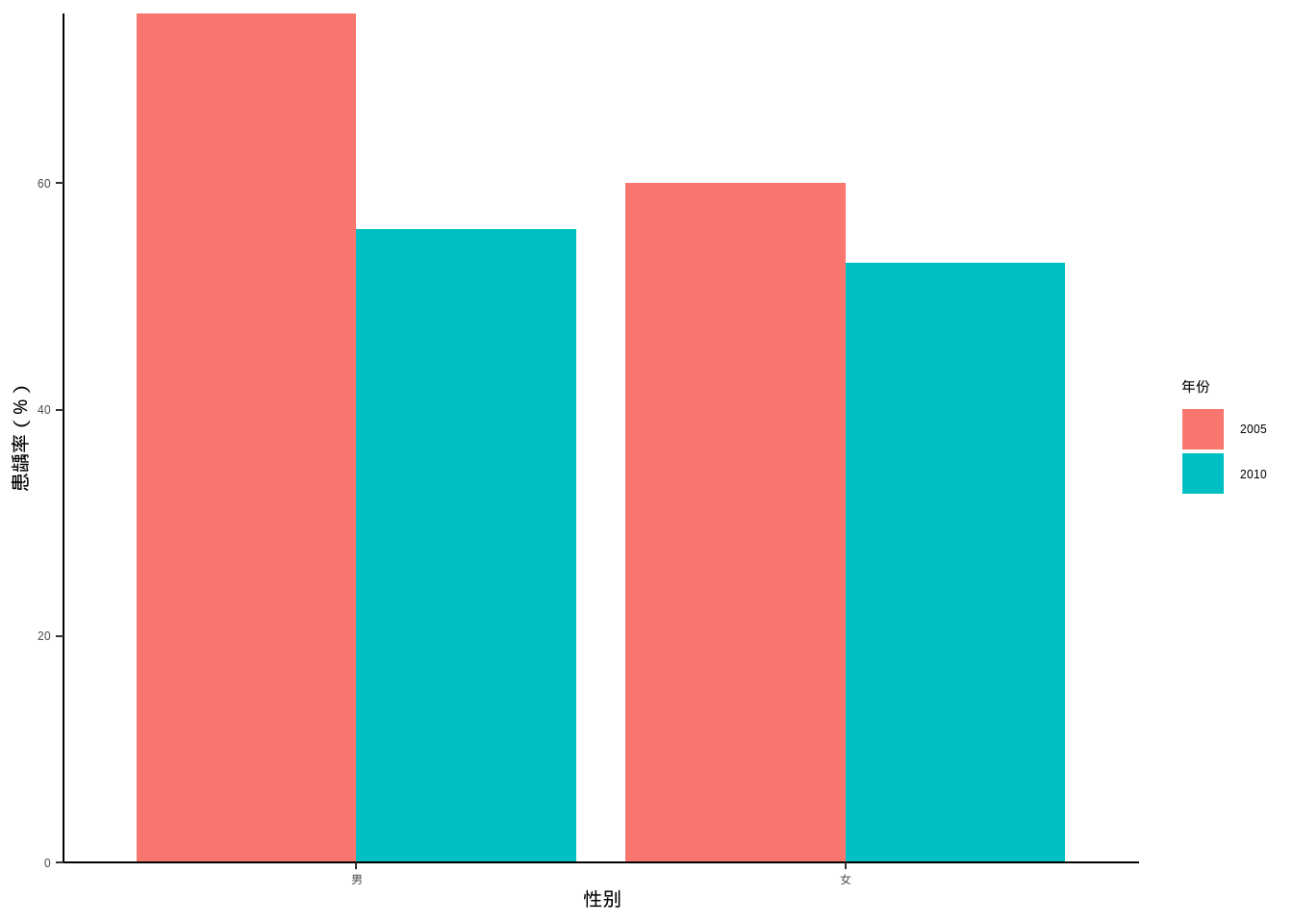
8.3 饼图
例10-6。饼图。
data10_6 <- data.frame(`失败原因`=c("无菌性松动","感染","假体周围骨折","假体不稳定","其他"),
                       `数量`=c(226,52,22,17,10))

library(dplyr)

data10_6 <- data10_6 %>%
  arrange(desc(`数量`)) %>%
  mutate(`失败原因`=factor(`失败原因`,levels=c("无菌性松动","感染",
                                       "假体周围骨折","假体不稳定","其他"))) %>%
  mutate(prop = round(`数量` / sum(`数量`),2),
         prop = scales::percent(prop))

data10_6
##       失败原因 数量 prop
## 1   无菌性松动  226  69%
## 2         感染   52  16%
## 3 假体周围骨折   22   7%
## 4   假体不稳定   17   5%
## 5 其他 10 3%由于ggplot2的大佬们普遍认为饼图是一种很差劲的图形,所以ggplot2对饼图的支持并不好。
# 默认的大概是这种程度
ggplot(data10_6, aes(x="",y=`数量`,fill=`失败原因`))+
  geom_bar(stat = "identity",width = 1,color="white")+
  geom_text(aes(label = prop),position = position_stack(vjust = 0.5))+
  coord_polar("y", start=0)+
  theme_void()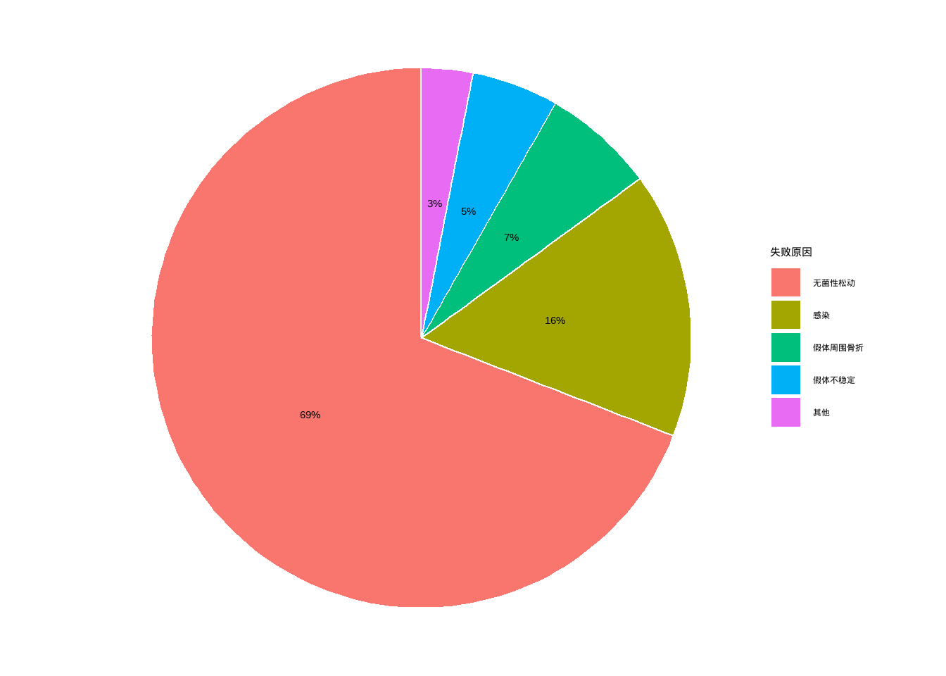
8.4 百分比条形图
例10-7。百分比条形图。
library(haven)
data10_7 <- haven::read_sav("datasets/例10-07.sav",encoding = "GBK")
data10_7 <- as_factor(data10_7)
data10_7
## # A tibble: 12 × 3
##    year   reason   percent
##    <fct>  <fct>      <dbl>
##  1 1996年 肺炎        23.4
##  2 1996年 早产        14.2
##  3 1996年 出生窒息    14.1
##  4 1996年 腹泻         5.6
##  5 1996年 意外窒息     4.1
##  6 1996年 其它        38.6
##  7 2000年 肺炎        19.5
##  8 2000年 早产        17
##  9 2000年 出生窒息    15.9
## 10 2000年 腹泻         4.9
## 11 2000年 意外窒息     3.7
## 12 2000年 其它 39library(scales)
ggplot(data10_7, aes(year, percent, fill=reason))+
geom_bar(stat = "identity",position = "stack",width = 0.5,color="black")+
labs(fill="",x="",y="")+
scale_y_continuous(labels = percent_format(scale = 1))+
guides(fill=guide_legend(reverse = T))+
theme_bw()+
theme(axis.text = element_text(size = 18, colour = "black"),
legend.text = element_text(size = 18, colour = "black"),
legend.position = "bottom")+
coord_flip()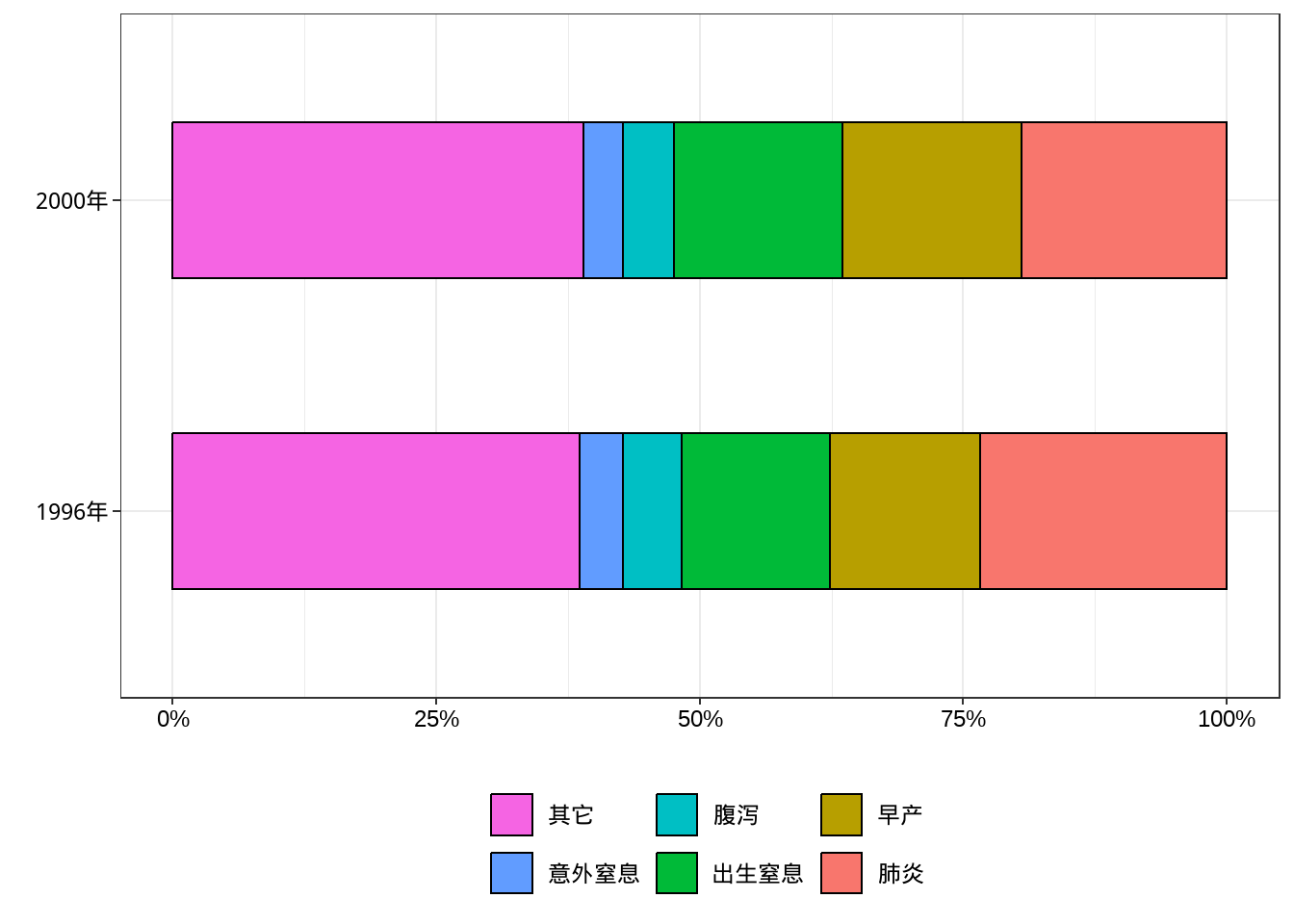
#ggsave("xxxx.png",width=10,height=5,dpi=300)8.5 折线图
例10-8。折线图。
library(haven)
data10_8 <- haven::read_sav("datasets/例10-08.sav",encoding = "GBK")
data10_8 <- as_factor(data10_8)
data10_8
## # A tibble: 10 × 3
##    year  agent counts
##    <fct> <fct>  <dbl>
##  1 2006  男      5500
##  2 2006  女      2500
##  3 2007  男      6000
##  4 2007  女      3000
##  5 2008  男      9000
##  6 2008  女      3500
##  7 2009  男     11000
##  8 2009  女      5000
##  9 2010  男     11000
## 10 2010 女 5000ggplot(data10_8, aes(year,counts))+
geom_line(aes(group = agent,linetype=agent))+
labs(x="年份",y="布氏菌病发病人数",linetype="性别")+
theme_classic()+
theme(axis.text = element_text(size = 18, colour = "black"),
axis.title = element_text(color = "black",size = 18),
legend.text = element_text(size = 18, colour = "black"),
legend.title = element_text(size = 18, colour = "black"))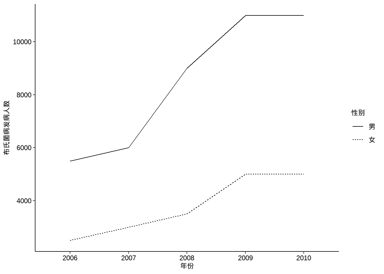
8.6 点线图
例10-9。点线图。
library(haven)
data10_9 <- haven::read_sav("datasets/例10-09.sav",encoding = "GBK")
data10_9 <- as_factor(data10_9)
data10_9
## # A tibble: 10 × 3
##     year 病型   发病率
##    <dbl> <fct>   <dbl>
##  1  1997 艾滋病 0.0069
##  2  1998 艾滋病 0.0177
##  3  1999 艾滋病 0.0187
##  4  2000 艾滋病 0.0312
##  5  2001 艾滋病 0.0468
##  6  1997 梅毒   3.76
##  7  1998 梅毒   4.58
##  8  1999 梅毒   5.72
##  9  2000 梅毒   6.09
## 10  2001 梅毒   6.27
p1 <- ggplot(data10_9, aes(year,`发病率`))+
geom_line(aes(group = `病型`,linetype=`病型`))+
geom_point(aes(group = `病型`,shape=`病型`),size=4)+
labs(x="年份",y="发病率(1/10万)")+
theme_classic()+
theme(axis.text = element_text(size = 14, colour = "black"),
axis.title = element_text(color = "black",size = 14),
legend.text = element_text(size = 14, colour = "black"),
legend.title = element_text(size = 14, colour = "black"))
p2 <- ggplot(data10_9, aes(year,log10(`发病率`)))+ # 不知道课本取的log几
geom_line(aes(group = `病型`,linetype=`病型`))+
geom_point(aes(group = `病型`,shape=`病型`),size=4)+
labs(x="年份",y="发病率(1/10万)")+
theme_classic()+
theme(axis.text = element_text(size = 14, colour = "black"),
axis.title = element_text(color = "black",size = 14),
legend.text = element_text(size = 14, colour = "black"),
legend.title = element_text(size = 14, colour = "black"))
library(patchwork)
p1+p2+plot_layout(guides = "collect")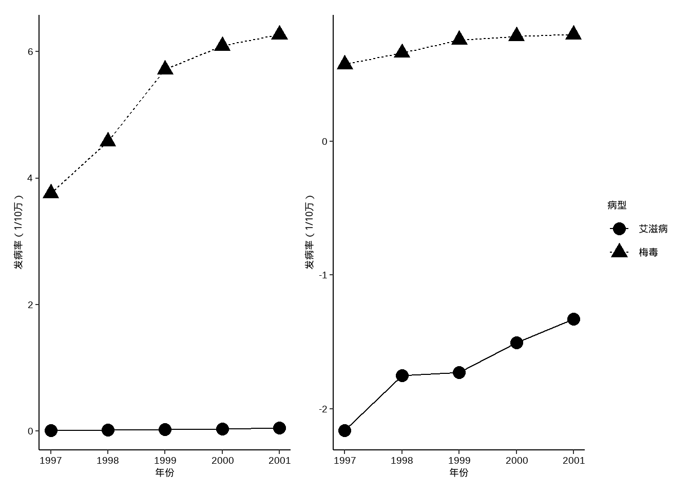
8.7 直方图
例10-10。直方图。
library(haven)
data10_10 <- haven::read_sav("datasets/例10-10.sav",encoding = "GBK")
data10_10 <- as_factor(data10_10)
data10_10
## # A tibble: 16 × 2
##    age   count
##    <fct> <dbl>
##  1 0-        7
##  2 1-       15
##  3 2-        8
##  4 3-       11
##  5 4-       14
##  6 5-       14
##  7 6-        8
##  8 7-        6
##  9 8-        3
## 10 9-        2
## 11 10-       8
## 12 15-       3
## 13 20-       1
## 14 25-       2
## 15 30-       1
## 16 35-40     1
下面这个其实假的直方图(虽然和课本中的看起来差不多),因为没给原始数据,给的是计数好的数据,所以是用条形图伪装的直方图:
ggplot(data10_10, aes(age,count))+
  geom_bar(stat = "identity",fill="white",color="black",
           width = 1,position = position_dodge(width = 1))+
  labs(x="年龄(岁)",y="每岁病例数")+
  scale_y_continuous(expand = c(0,0))+
  theme_classic()+
  theme(axis.title = element_text(color = "black",size = 15))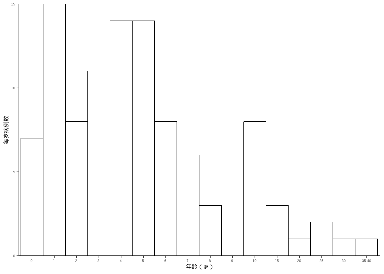
8.8 地图
例10-11。地图。没给数据,直接自己编一个。
首先下载中国地图。中国地图下载地址:地图选择器
library(ggplot2)
library(sf)
library(dplyr)

china_map <- st_read("datasets/中华人民共和国.json")
## Reading layer `中华人民共和国' from data source
##   `F:\R_books\medstat_quartobook\datasets\中华人民共和国.json'
##   using driver `GeoJSON'
## Simple feature collection with 35 features and 10 fields
## Geometry type: MULTIPOLYGON
## Dimension:     XY
## Bounding box:  xmin: 73.50235 ymin: 3.397162 xmax: 135.0957 ymax: 53.56327
## Geodetic CRS:  WGS 84
然后给每个省编点数据:
set.seed(123)
china_map <- china_map %>%
  mutate(name_short=substr(name,1,2),
         number = sample(10:100,35,replace=F),
         group = sample(paste0("group",1:5),35,replace=T))

china_map$name_short[c(5,8)] <- c("内蒙古","黑龙江")画图即可,ggplot2画地图非常厉害,下面这个只是非常基础的,可以进行非常多的修改。
ggplot(data = china_map) +
  geom_sf(aes(fill=group)) +
  geom_sf_text(aes(label = name_short),nudge_y = 0,size=2)+
  geom_sf_text(aes(label = number),nudge_y = -1,size=2)+
  theme_minimal()
## Warning in st_point_on_surface.sfc(sf::st_zm(x)): st_point_on_surface may not
## give correct results for longitude/latitude data
## Warning in st_point_on_surface.sfc(sf::st_zm(x)): st_point_on_surface may not
## give correct results for longitude/latitude data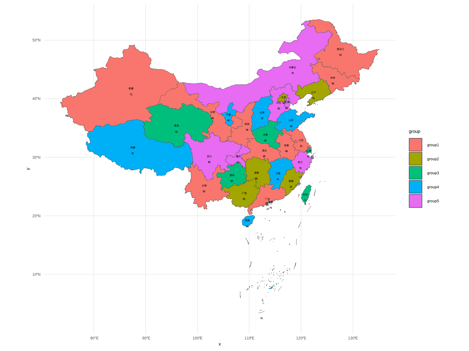
8.9 箱线图
例10-12。箱线图。没给数据,直接用R语言自带的iris数据演示一下。
library(ggplot2)

ggplot(iris, aes(Species,Sepal.Length))+
  stat_boxplot(geom = "errorbar",width = 0.2)+
  geom_boxplot()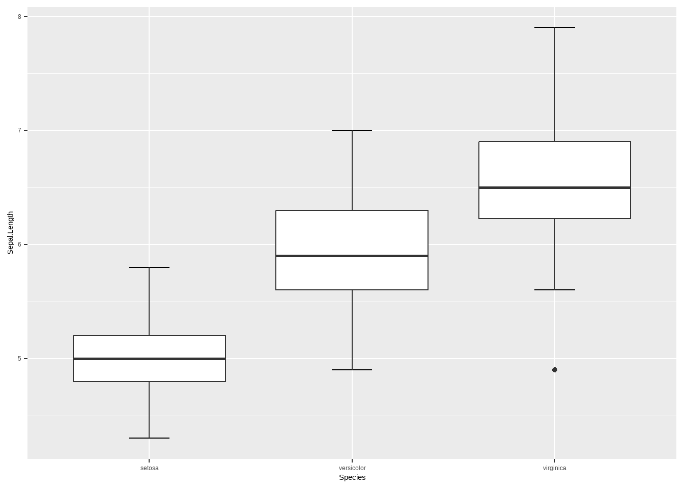
8.10 茎叶图
例10-13。茎叶图。
library(haven)
data10_13 <- haven::read_sav("datasets/例10-13.sav",encoding = "GBK")
data10_13 <- as_factor(data10_13)
data10_13
## # A tibble: 138 × 1
##      rbc
##    <dbl>
##  1  3.96
##  2  3.77
##  3  4.63
##  4  4.56
##  5  4.66
##  6  4.61
##  7  4.98
##  8  5.28
##  9  5.11
## 10  4.92
## # ℹ 128 more rows
R自带函数就可以画(但是这个图很少用):
stem(data10_13$rbc,scale = 1)
##
##   The decimal point is 1 digit(s) to the left of the |
##
##   30 | 7
##   31 |
##   32 | 17
##   33 | 9
##   34 | 2
##   35 | 299
##   36 | 0124467789
##   37 | 12266679
##   38 | 3399
##   39 | 166667778
##   40 | 11122223344
##   41 | 2234666789
##   42 | 000011133345566666667888999
##   43 | 01223466666
##   44 | 12279
##   45 | 4566677
##   46 | 111366899
##   47 | 15666
##   48 | 139
##   49 | 258
##   50 | 13
##   51 | 12
##   52 | 348
##   53 |
##   54 | 6
8.11 误差条图
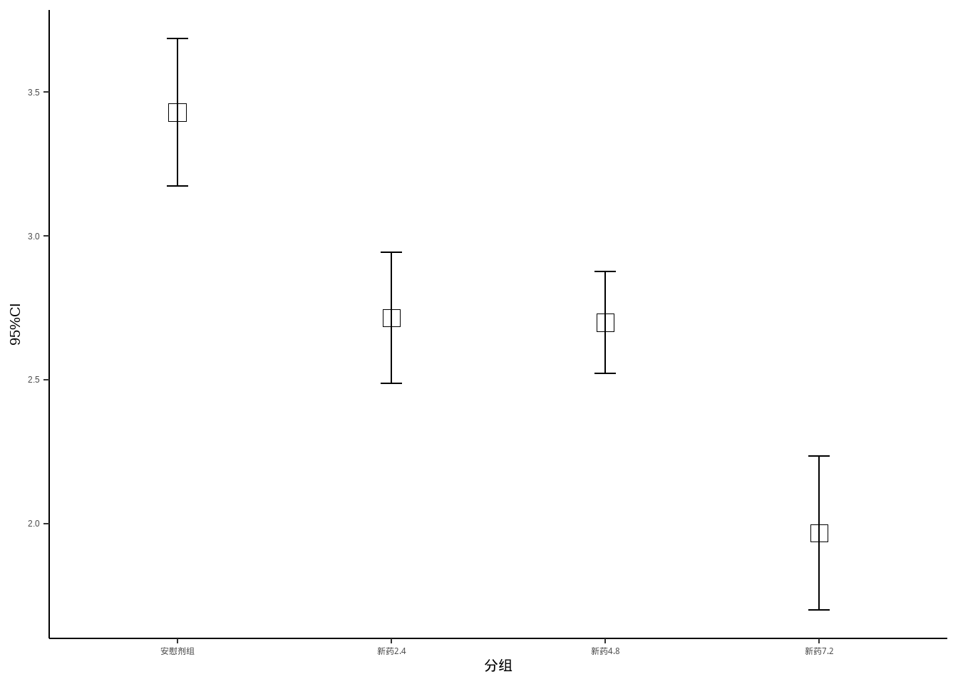
例10-14。误差条图。
library(haven)
data10_14 <- haven::read_sav("datasets/例10-14.sav",encoding = "GBK")
data10_14 <- as_factor(data10_14)
data10_14
## # A tibble: 120 × 2
##    group     dmdz
##    <fct>    <dbl>
##  1 安慰剂组  3.53
##  2 安慰剂组  4.59
##  3 安慰剂组  4.34
##  4 安慰剂组  2.66
##  5 安慰剂组  3.59
##  6 安慰剂组  3.13
##  7 安慰剂组  2.64
##  8 安慰剂组  2.56
##  9 安慰剂组  3.5
## 10 安慰剂组  3.25
## # ℹ 110 more rows
先计算每个组的均值和可信区间:
95%可信区间的计算:均值±1.96*标准误,见书中第一章第三节:总体均数的估计
library(dplyr)

data10_14_1 <- data10_14 %>%
  group_by(group) %>%
  summarise(mm = mean(dmdz),
            lower = mm - 1.96*(sd(dmdz)/sqrt(30)),
            upper = mm + 1.96*(sd(dmdz)/sqrt(30)))
data10_14_1
## # A tibble: 4 × 4
##   group       mm lower upper
##   <fct>    <dbl> <dbl> <dbl>
## 1 安慰剂组  3.43  3.17  3.69
## 2 新药2.4   2.72  2.49  2.94
## 3 新药4.8   2.70  2.52  2.88
## 4 新药7.2 1.97 1.70 2.23ggplot(data10_14_1)+
geom_point(aes(group,mm),size=4,shape=0)+
geom_errorbar(aes(x=group,ymin=lower,ymax=upper),
width=0.1)+
theme_classic()+
labs(x="分组",y="95%CI")+
theme_classic()+
theme(axis.title = element_text(color = "black",size = 15))